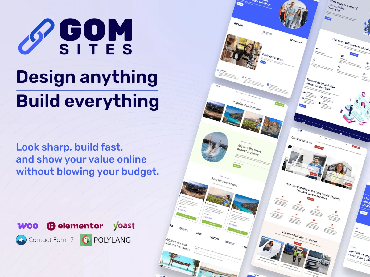
GOM Sites
On this page, you will find all the necessary documentation to learn the basic concepts about the installation of the template, the plugins, and how it works.
Welcome to the official GOM Sites documentation.
This guide has been created to help you take full advantage of the theme, facilitating its installation, configuration, and use.
Here you will find clear and detailed instructions to adapt the theme to your needs, regardless of your level of technical experience—from beginner users to advanced developers.
Before installing GOM Sites, ensure your server meets the following minimum requirements for optimal performance:
It is recommended to contact your hosting provider if you need to modify these values.
Before installing the GOM Sites theme, a functional WordPress installation is required.
First, you need a hosting provider where your website files will be stored. Some recommended options are:
Select a plan according to your needs and register a domain name if you do not already have one.
For a detailed step-by-step guide, you can consult the official WordPress documentation.
Once WordPress is installed, you can proceed to download the theme.
Downloading the File
Two download options will be displayed:
Select the desired option and save the file in a secure location on your computer. Ensure the download completes correctly.
For more information, you can consult the official ThemeForest documentation.
Once WordPress is correctly installed and you have downloaded the template from ThemeForest, you can proceed with the installation of the GOM Sites theme.
Note: Ensure you have administrator permissions to install and activate themes.
WordPress will begin the process of uploading and installing the theme.
Once the installation is complete:
Note: If you wish to learn more about activating and using child themes, you can consult the official WordPress documentation.
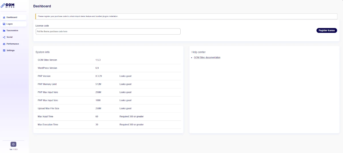
To unlock all GOM Sites functionalities, such as demo imports and the installation of included plugins, it is necessary to activate the theme license.
The purchase code is obtained from Envato (ThemeForest). Consult this official Envato guide to locate it: Where Is My Purchase Code?
Ensure you copy the full code, as it will be required for activation.
Important: Initially, the dashboard will not display the demo import and plugin installation modules.
Inside the dashboard, you will find three main sections:
You will also see a message indicating that you must register your purchase code to unlock:
Activating the License
Once the license is successfully registered, all modules and functionalities that GOM Site Theme has to offer will be enabled.
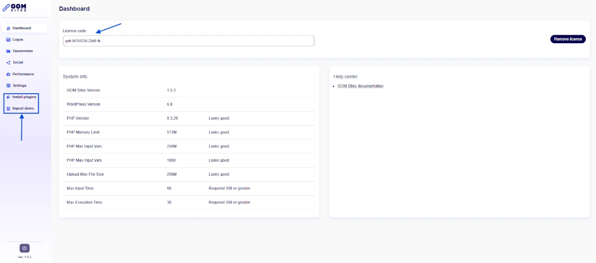
Once the GOM Sites theme is correctly installed and the license has been registered, the modules required for installing plugins and website demos will be automatically enabled.
These plugins can be managed from both the GOM Site Dashboard and the WordPress workspace.
Within the WordPress admin panel, access the GOM Sites Theme module. From this module, you can centrally manage the installation of the plugins required for the theme’s correct operation.
This section will display a table with all available plugins, both mandatory and recommended. Each plugin will include the following information:
At the top of the list, you will find the “Bulk Actions” option. This functionality allows you to:
This considerably facilitates and speeds up the initial site configuration process.
Note: If an error occurs when trying to install all plugins using Bulk Actions, try installing them one by one.
Below are the details of the plugins that will appear in the installation list:
Main Plugins
Demo importing allows you to quickly create a fully functional website using pre-configured designs included in GOM Sites. This process is performed through the One Click Demo Import (OCDI) plugin, which offers two import methods.
The OCDI plugin features two import modes:
In this mode, you can manually select the types of content you wish to import by uploading the corresponding files from your computer. This method is ideal when:
This mode allows selecting one of the demonstrations prepared by the theme authors. This mode is only available when the theme has been integrated with the OCDI plugin, as is the case with GOM Sites.
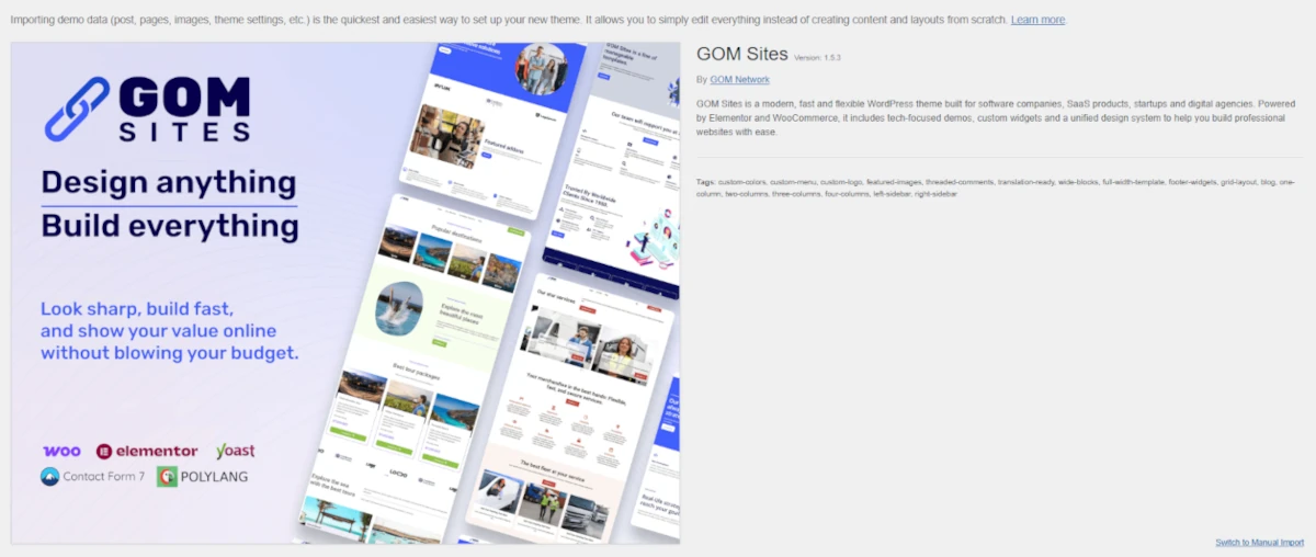
GOM Sites is constantly growing and offers a variety of pre-configured demos to facilitate the creation of attractive and functional websites. Demonstrations include:
Each demo has been designed with:
These plugins must be installed and active to guarantee correct content display and access to all theme functionalities. The required plugins are:
Before starting the content import, a list of plugins associated with the selected demo will be displayed.
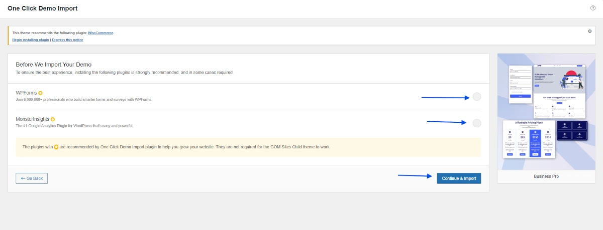
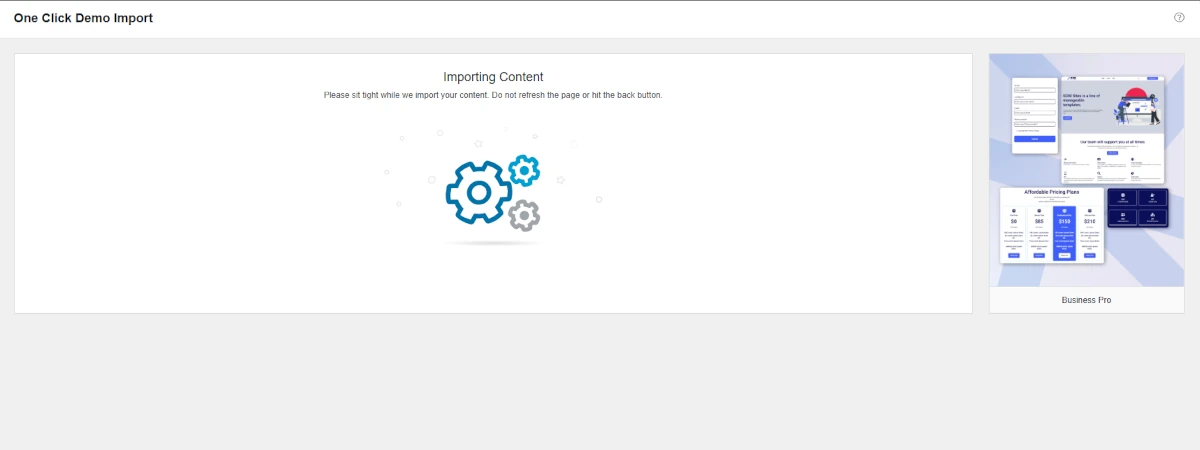
Once all plugins are correctly installed, the demo import process will begin.
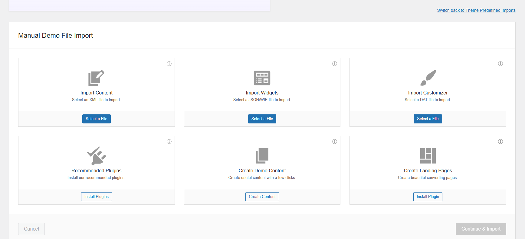
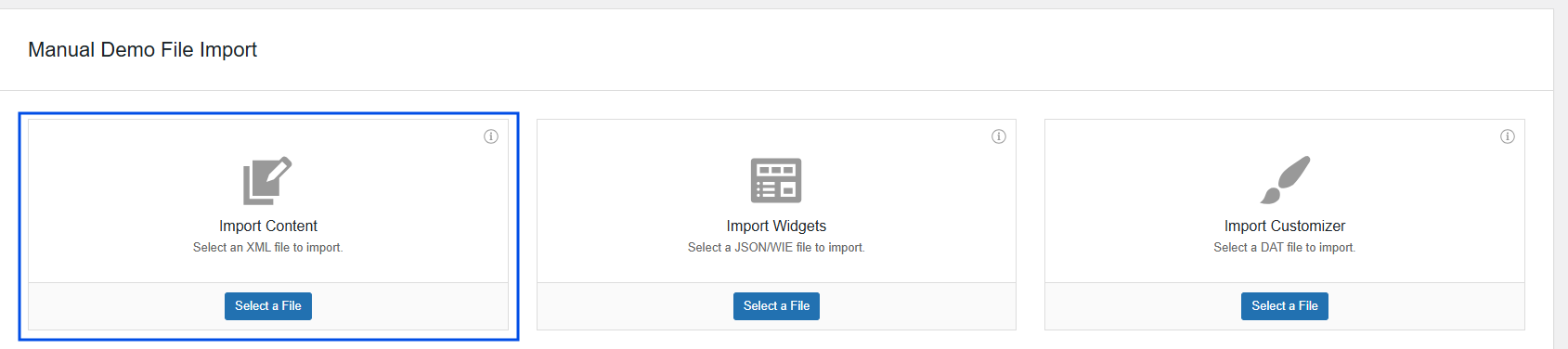
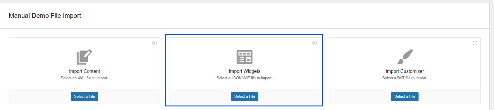
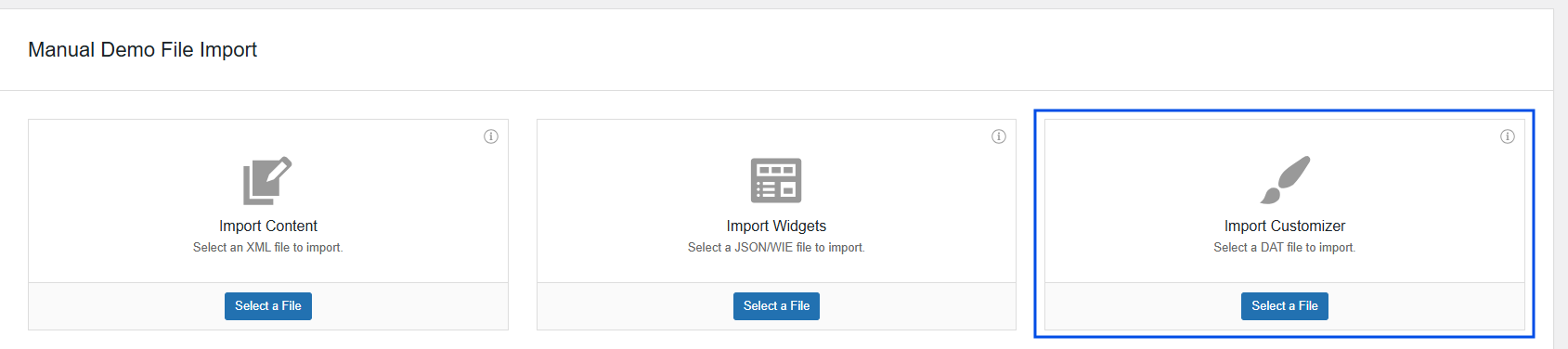
If the theme does not have direct integration with OCDI or if you wish to import specific files, the Manual Import option will be displayed. From this screen, you can upload files to import different types of content:
Once the desired files are selected, click “Continue & Import” to start the process.
To correctly import Elementor styles, follow the steps below.
Download the theme .zip file, which contains the following folders:
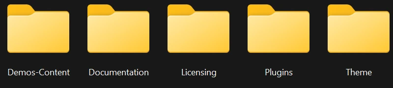
Inside this folder, you will find several subfolders, each corresponding to a specific demo.
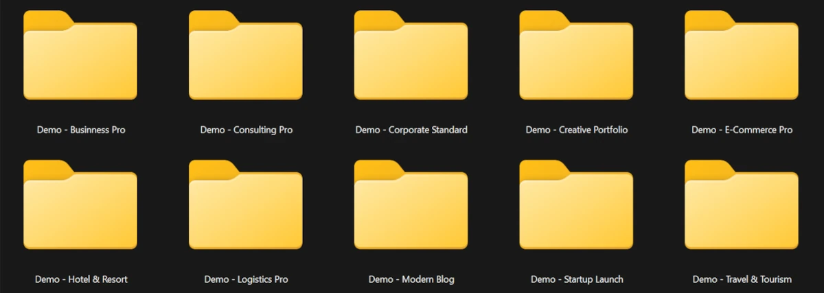
Below is the process described using the Business Pro demo as an example.
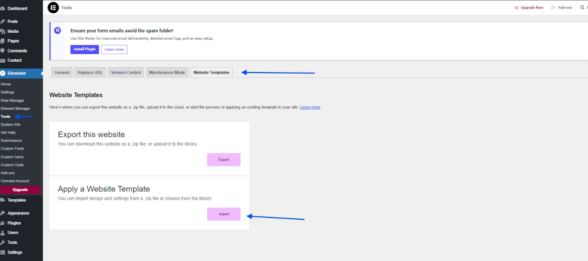
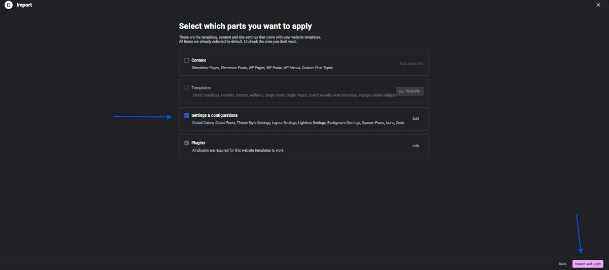
The installation of the settings ZIP file allows you to apply additional global site configurations via Elementor, ensuring that the design and styles function correctly according to the demo or selected configuration.
Within Tools, select the “Website Templates” tab. Two options will be displayed:
Select the “Apply a Website Template” option.
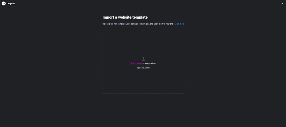
Once the file has been successfully uploaded, a screen with several import options will be displayed.
Upon completing the process, a confirmation screen will appear with the following message: “Your website templates are now live on your site.” On this screen, you will be able to view a summary of the imported information.
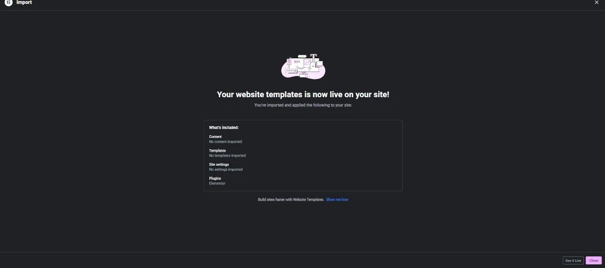
After completing this process:
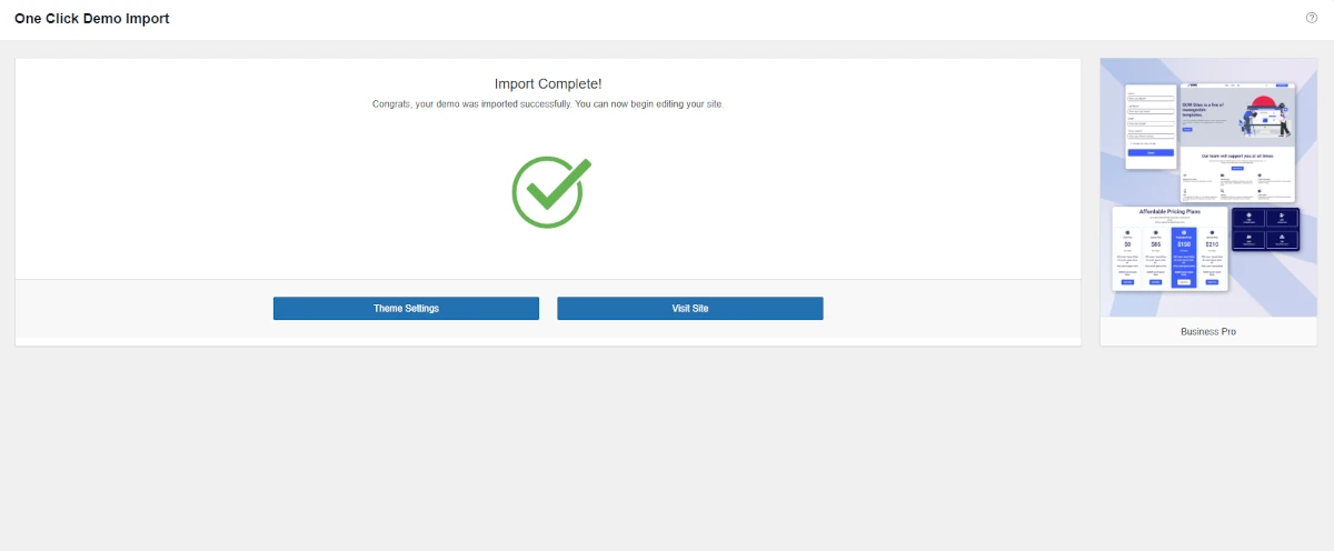
Once the import process has started, the progress screen will be displayed.
If everything completes correctly, the message:
“Import Complete!” will appear.
If a problem occurs during the import:
In the log file, you will find:
Keeping GOM Sites updated ensures compatibility, security, and access to new features. Theme updates are distributed through Envato Market.
To receive automatic theme updates, it is necessary to install the Envato Market plugin for WordPress. This plugin allows customers to receive updates quickly, securely, and directly from the WordPress dashboard.
Below are the steps to correctly configure the plugin.
In order for WordPress to connect to Envato Market, you need to generate a personal API token.
During token creation:
Once the connection with the Envato API is established:
For more technical details and advanced options, you can consult the official Envato Market plugin documentation.
In this section, we will explain in detail how to customize and configure the different pages and elements of the GOM Site theme to suit your needs.
You will learn how to modify the structure, design, and key functionalities of each page, from “Headers” to “Footers” or “Templates” you want to include.
Additionally, we will show you how to edit and reorganize content blocks using the Elementor visual editor.
By following these instructions, you will be able to adjust the template efficiently and professionally, ensuring that your website looks attractive, functional, and aligned with your brand identity.
First, go to the left sidebar in the WordPress dashboard and look for “GOM Tool Elementor Addons”. This will display several options, which are:
When you hover over “GOM Tool Elementor Addons”, it will show four options to choose from:
You must click on “Theme Headers”, and it will take you to the module where the list of created headers is displayed.
At the top of this list, you will find several actions you can perform:
Additionally, you will see the “New Theme Header” button, which will take you to the module where you can create new headers.
Once inside the “Theme Headers” module, go to the top section, where you will find the “New Theme Header” button. Clicking it will redirect you to the “New Theme Headers” module.
The first thing you will see in this module is the field where you enter the header title.
To the right, you will find the “Post Attributes” field, which contains several options:
Expand the available options in the field and select “GOM Tool Elementor Headers”. This ensures that the created page is displayed correctly on your website.
After selecting “GOM Tool Elementor Header”, enter the title and press the “Publish” button. Once published, click the “Edit with Elementor” button.
This will take you to the Elementor editor, where you can customize your header in the style you prefer.
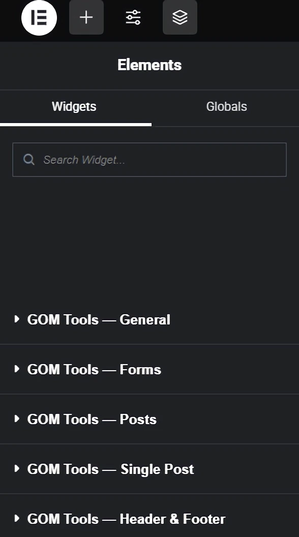
Once you are in the Elementor editor, you will see a left sidebar with a list of elements that you can add to your design.
You will find Elementor’s own elements and GOM Tools elements, which are divided into various categories depending on the section you want to create on your website.
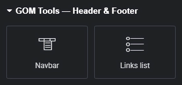
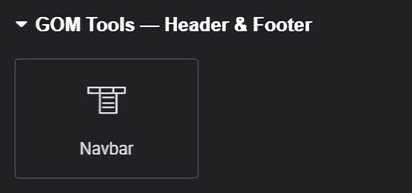
In this case, we will explain the widgets for creating your header. First, go to the category named “GOM Tools – Header & Footer”. In that category, you will see two widgets:
This widget allows you to create and configure the header of your website. It enables you to add and edit the logo design, menu for desktop and mobile, search bar, and a button.
Once you have added the header to your design, you can customize it according to your needs and preferences.
You can add a logo, menus, submenus, a search bar, buttons, and change colors, fonts, styles, links, and more.
We offer various advanced customization options for the header so that you have complete control over the appearance and behavior of your header.
All Elementor content is divided into “Content” and “Style”. Below, we explain each of them and their respective sections for editing the header:
Once you have created your custom design with “GOM Tools – Header & Footer”, make sure to save the changes. You can do this by clicking the “Save” button at the bottom of the editor.
First, go to the left sidebar in the WordPress dashboard and look for “GOM Tool Elementor Addons”. This will display several options, which are:
When you hover over “GOM Tool Elementor Addons”, it will show four options to choose from:
You must click on “Theme Footers”, and it will take you to the module where the list of created footers is displayed.
At the top of this list, you will find several actions you can perform:
Additionally, you will see the “New Theme Footer” button, which will take you to the module where you can create new footers.
Once inside the “Theme Footers” module, go to the top section, where you will find the “New Theme Footer” button. Clicking it will redirect you to the “New Theme Footer” module.
The first thing you will see in this module is the field where you enter the footer title.
To the right, you will find the “Post Attributes” field, which contains several options:
Expand the available options in the field and select “GOM Tool Elementor Footer”. This ensures that the created page is displayed correctly on your website.
After selecting “GOM Tool Elementor Footer”, enter the title and press the “Publish” button. Once published, click the “Edit with Elementor” button.
This will take you to the Elementor editor, where you can customize your footer in the style you prefer.
Once you are in the Elementor editor, you will see a left sidebar with a list of elements that you can add to your design.
You will find Elementor’s own elements and GOM Tools elements, which are divided into various categories depending on the section you want to create on your website.
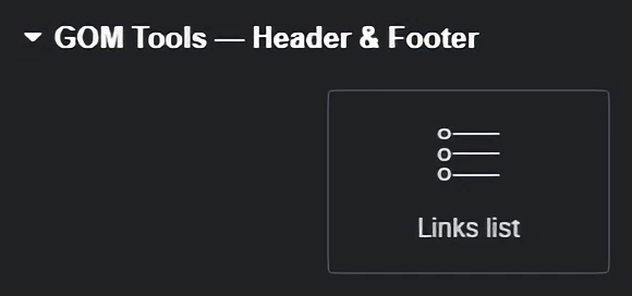
In this case, we will explain the widgets for creating your footer. First, go to the category named “GOM Tools – Header & Footer”. In that category, you will see two widgets:
This widget, as its name suggests, allows you to create lists of links (such as the lists found in footers) to help users navigate your website.
Once you have added the list of links to your design, you can customize it according to your needs and preferences.
You can change colors, fonts, styles, links, and more.
We offer various advanced customization options for the link list, so you have complete control over its appearance and behavior.
All Elementor content is divided into “Content” and “Style”. Below, we explain each of them and their respective sections for editing the footer:
You can continue adding more links by clicking the “Add Item” button or duplicate an existing link by clicking the button on the right side of the section under the “Item Title”.
Once you have created your custom footer design with “GOM Tools – Header & Footer”, make sure to save the changes.
You can do this by clicking the “Save” button at the bottom of the editor.
First, go to the left sidebar in the WordPress dashboard and look for “GOM Tool Elementor Addons”. This will display several options, which are:
When you hover over “GOM Tool Elementor Addons”, it will show four options to choose from:
You must click on “Theme Templates”, and it will take you to the module where the list of created templates is displayed.
At the top of this list, you will find several actions you can perform:
Additionally, you will see the “New Theme Template” button, which will take you to the module where you can create new templates.
Once inside the “Theme Templates” module, go to the top section, where you will find the “New Theme Template” button. Clicking it will redirect you to the “New Theme Template” module.
This time, you must first select the type of template you want to create.
Go to the “Settings” field, which is located on the right side of the module, and expand the options to choose the template type you want to create. The available options are:
Once you have selected the template type you want to create, go to the “Post Attributes” field, which is located in the same column as the “Settings” field.
This field contains several options:
Expand the available options in the field and select “GOM Tool Elementor Full Width”.
This ensures that the created page is displayed correctly on your website.
After selecting “GOM Tool Elementor Full Width”, enter the title and press the “Publish” button.
Once published, click the “Edit with Elementor” button.
This will take you to the Elementor editor, where you can customize your template in the style you prefer.
Once you are in the Elementor editor, you will see a left sidebar with a list of elements that you can add to your design.
You will find Elementor’s own elements and GOM Tools elements, which are divided into various categories depending on the section you want to create on your website.
In this section of the documentation, we will discuss the widgets included in GOM Tool Elementor Addons, which are:
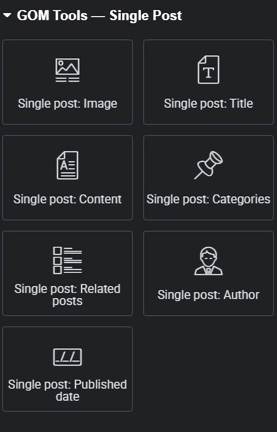
GOM Tools – Single Post:
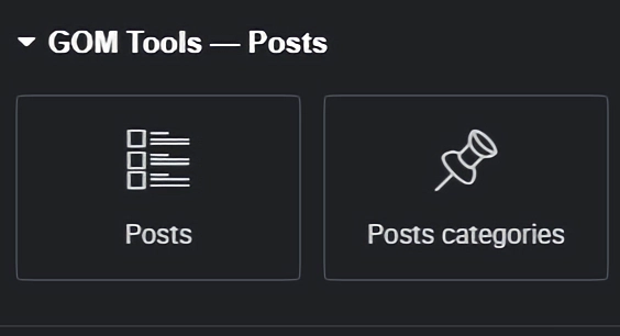
GOM Tools – Post:
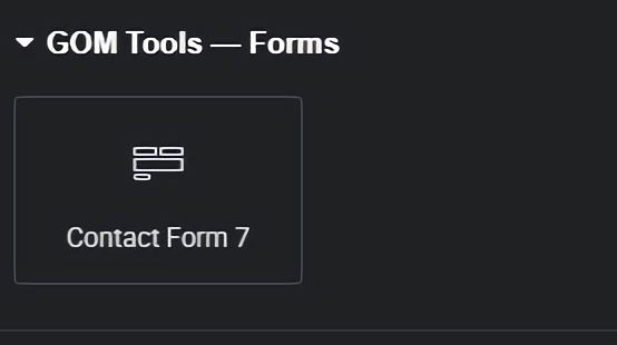
GOM Tools – Forms:
Below, you will find them in their respective modules.
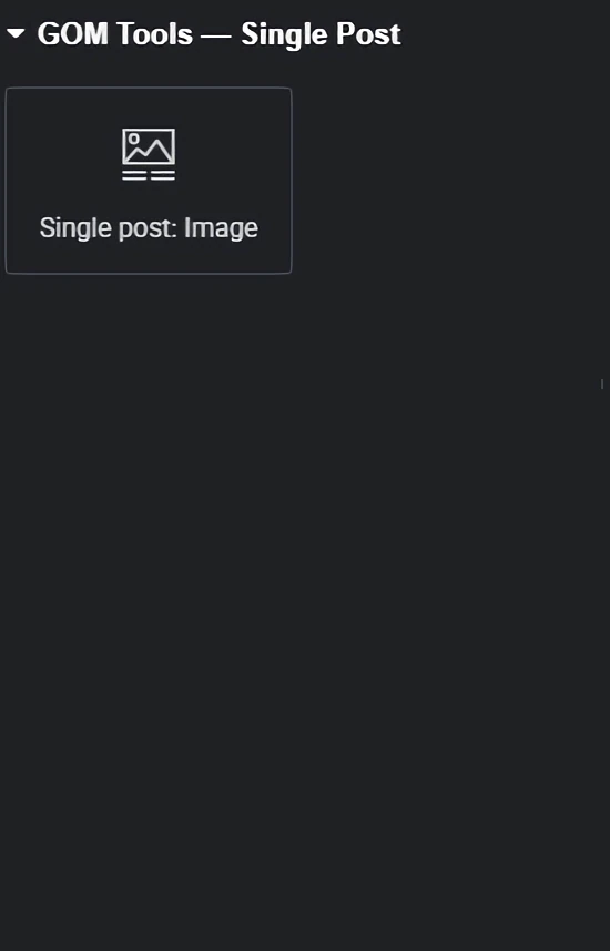
Single Post Image: This widget allows you to add the featured image of the post to the Single Post template.
Once you have added the widget to your design, you can customize it according to your needs and preferences.
You can change colors, fonts, styles, links, and more.
We offer various advanced customization options for your site, allowing you full control over the appearance and behavior of the element.
All Elementor content is divided into “Content” and “Style”. Below, we explain each of them and their respective sections for editing the header:
Once you have created your custom design with “GOM Tools – Single Post”, make sure to save the changes.
You can do this by clicking the “Save” button at the bottom of the editor.
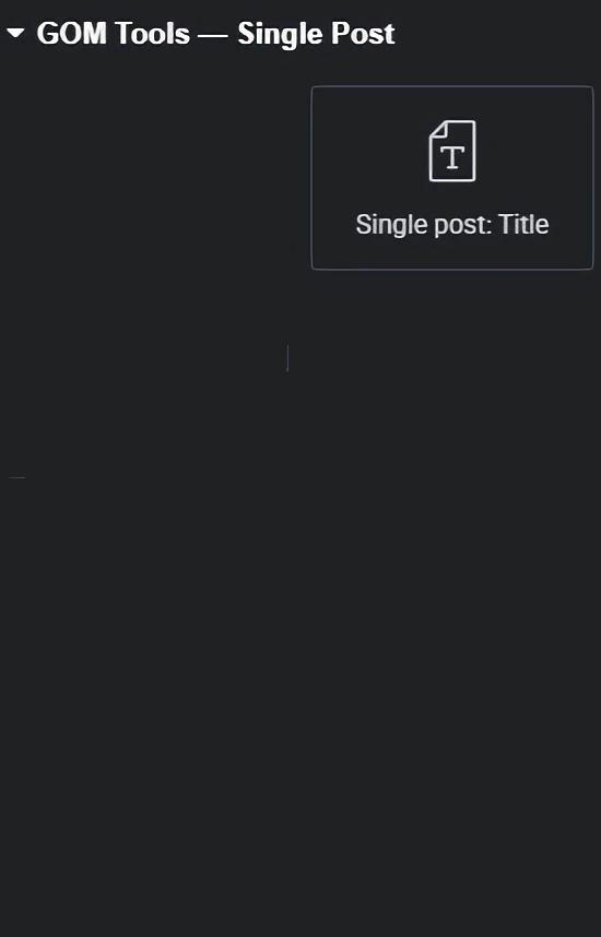
Single Post Title: This widget allows you to add the post title to the template.
Once you have added the widget to your design, you can customize it according to your needs and preferences.
You can change colors, fonts, styles, links, and more.
We offer various advanced customization options for your site, allowing you full control over the appearance and behavior of the element.
All Elementor content is divided into “Content” and “Style”. Below, we explain each of them and their respective sections for editing the header:
Once you have created your custom design with “GOM Tools – Single Post”, make sure to save the changes.
You can do this by clicking the “Save” button at the bottom of the editor.
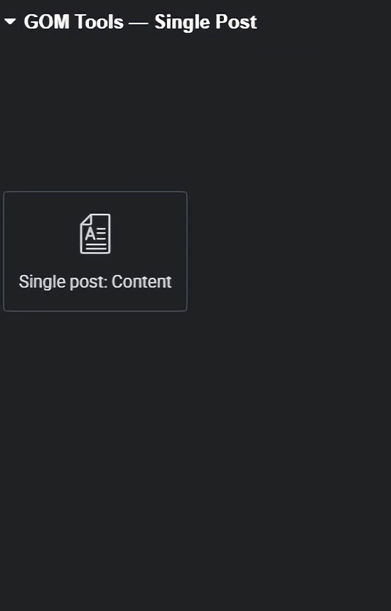
Single Post Content: This widget allows you to add the post content to the template.
Once you have added the widget to your design, you can customize it according to your needs and preferences.
You can change colors, fonts, styles, links, and more.
We offer various advanced customization options for your site, allowing you full control over the appearance and behavior of the element.
All Elementor content is divided into “Content” and “Style”. Below, we explain each of them and their respective sections for editing the header:
H5
H6
Once you have created your custom design with “GOM Tools – Single Post”, make sure to save the changes.
You can do this by clicking the “Save” button at the bottom of the editor.
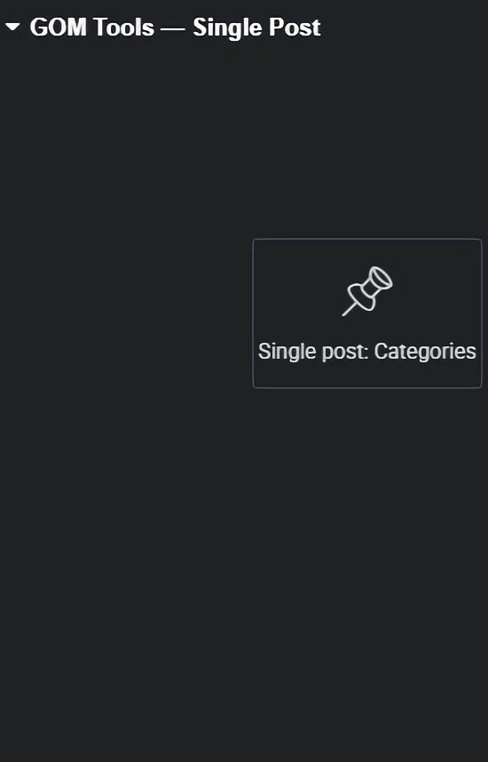
Single post categories: This widget allows you to add the categories of single posts in the template.
Once you have added the widget to your design, you can customize it according to your needs and preferences. You can change colors, fonts, styles, links, and more. We offer several advanced customization options for your site, allowing you full control over the appearance and behavior of the element.
All Elementor content is divided into “Content” and “Style”, and we will explain each of them and their respective sections for editing the header.
Once you have created your custom design with “GOM Tools – Single Post”, make sure to save the changes. You can do this by clicking the “Save” button at the bottom of the editor.
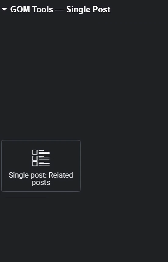
Single post: Related posts – This widget allows you to add related posts to the template.
Once you have added the widget to your design, you can customize it according to your needs and preferences. You can change colors, fonts, styles, links, and more. We offer several advanced customization options for your site, allowing you full control over the appearance and behavior of the element.
All Elementor content is divided into “Content” and “Style”, and we will explain each of them and their respective sections for editing the header.
Once you have created your customized design with “GOM Tools – Single post”, make sure to save the changes. You can do this by clicking on the “Save” button at the bottom of the editor.
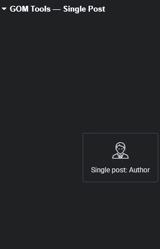
Single post: Author: This widget allows you to add the post author in the template.
Once you have added the widget to your design, you can customize it according to your needs and preferences. You can change colors, fonts, styles, links, and more. We offer several advanced customization options that you may need for your site, allowing you to have full control over the appearance and behavior of the element.
All Elementor contents are divided into “Content” and “Style”. We will explain each of them and their respective section for editing the header.
Once you have created your customized design with “GOM Tools – Single post”, make sure to save the changes. You can do this by clicking on the “Save” button at the bottom of the editor.
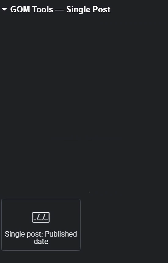
Single post: Published date: This widget allows you to add the post’s publication date in the template.
Once you have added the widget to your design, you can customize it according to your needs and preferences. You can change colors, fonts, styles, links, and more. We offer several advanced customization options that you may need for your site, allowing you to have full control over the appearance and behavior of the element.
All Elementor contents are divided into “Content” and “Style”. We will explain each of them and their respective sections for editing the header.
Once you have created your customized design with “GOM Tools – Single post”, make sure to save the changes. You can do this by clicking on the “Save” button at the bottom of the editor.
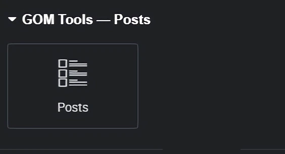
Posts: This widget allows you to add posts in the template.
Once you have added the widget to your design, you can customize it according to your needs and preferences. You can change the colors, the fonts, the styles, the links, and more. We offer several advanced customization options that you may want for your site, which allows you to have total control over the appearance and behavior of the element.
All the contents of Elementor are divided into “Content” and “Style”, we will explain each one of them and their respective section to edit the heading.
Once you have created your custom design with “GOM Tools – Posts”, make sure to save the changes. You can do this by clicking the “Save” button at the bottom of the editor.
Posts categories: This widget allows you to add post categories in the template.
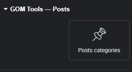
Once you have added the widget to your design, you can customize it according to your needs and preferences. You can change colors, fonts, styles, links, and more. We offer several advanced customization options that you may need for your site, allowing you to have full control over the appearance and behavior of the element.
All Elementor contents are divided into “Content” and “Style”. We will explain each of them and their respective sections for editing the header.
Once you have created your customized design with “GOM Tools – Posts”, make sure to save the changes. You can do this by clicking on the “Save” button at the bottom of the editor.
Contact Form 7: This widget allows you to add forms in the template.
Once you have added the widget to your design, you can customize it according to your needs and preferences. You can change colors, fonts, styles, links, and more. We offer several advanced customization options that you may need for your site, allowing you to have full control over the appearance and behavior of the element.
All Elementor contents are divided into “Content” and “Style”. We will explain each of them and their respective sections for editing the header.
Once you have created your customized design with “GOM Tools – Contact Form 7”, make sure to save the changes. You can do this by clicking on the “Save” button at the bottom of the editor.
Banners carousel: This widget allows you to add an image carousel in the template.
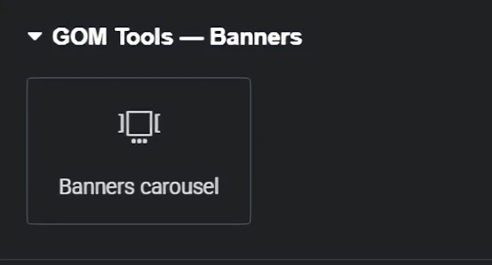
Once you have added the widget to your design, you can customize it according to your needs and preferences. You can change the colors, fonts, styles, links, and more. We offer several advanced customization options that you may want for your site, allowing you to have full control over the appearance and behavior of the element.
All Elementor content is divided into “Content” and “Style”, we will explain each of them and their respective section to edit it.
You can continue adding more fields by clicking the “Add item” button or copy the already created banner by clicking the button that appears on the right side of the section with the “Field title”.
Once you have created your custom design with “GOM Tools – Banners carousel”, make sure to save the changes. You can do this by clicking on the “Save” button at the bottom of the editor.
Card carousels: This widget will display several cards or elements horizontally, allowing you to scroll or navigate through them.
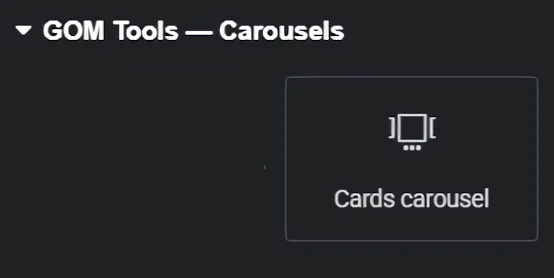
Once you have added the widget to your design, you can customize it according to your needs and preferences. You can change colors, fonts, styles, links, and more. We offer several advanced customization options for your site, giving you full control over the appearance and behavior of the element.
All Elementor contents are divided into “Content” and “Style”. We will explain each of them and their respective section for editing.
You can continue adding more fields by clicking the “Add item” button or copy an already created banner by clicking the button that appears on the right side of the section with the “Field Title”.
Once you have created your custom design with “GOM Tools – Card carousels”, make sure to save the changes. You can do this by clicking the “Save” button at the bottom of the editor.